Dark & light mode
Dark Mode or Light Mode? Pick the wallpaper to match
The same wallpaper can look great in one mode and wrong in the other. Dark Mode wants dark, low-contrast art; Light Mode wants bright, even colour. Here is how to choose for each, with designs from this site that do both jobs.
What Dark Mode and Light Mode actually change
On iOS, Dark Mode and Light Mode change the system: menus, backgrounds, and app interfaces go dark or light. Your wallpaper does not change with them. iOS does not swap your wallpaper when the mode changes, and there is no built-in setting that links one wallpaper to Dark Mode and another to Light Mode. What you set is what you get, in both modes, until you change it yourself. That is the first fact to build on, because it means the choice is not which wallpaper goes with which mode — it is which wallpaper survives both modes, or how you switch between two wallpapers when the mode changes.
The reason the mode matters at all is contrast. In Dark Mode the whole phone is dark, and a bright wallpaper becomes the brightest thing on the screen by a wide margin. Every time you wake the phone at night, a pale wallpaper flashes at you before your eyes adjust, and in a dark room it lights up your face. In Light Mode the opposite happens: a very dark wallpaper can look like a dead screen against bright menus, and the boundary between the wallpaper and the interface becomes a hard edge. Neither is a defect in the wallpaper — it is a mismatch between the picture and the system around it. The fix is to pick a wallpaper whose brightness sits near the brightness of the mode you use most, and to switch deliberately when you change modes for a long stretch.
There is also a folding-phone twist. The crease on the iPhone Duo's inner display is far more visible against a bright, flat background than against a dark one, because the fold is a dip that catches light. In Dark Mode that works in your favour: a dark wallpaper hides the crease almost completely. In Light Mode it works against you, because the mode invites bright wallpapers, and bright wallpapers show the fold. So the practical rule is simple: if you live in Dark Mode, you can use almost anything dark and the crease will take care of itself; if you live in Light Mode, you need to choose more carefully, and favour designs with texture and uneven light over flat pale colour.
| Dark Mode | Light Mode | |
|---|---|---|
| Best wallpaper | Dark, low-contrast, deep colour | Bright, even, mid-tone colour |
| Crease visibility | Hidden — dark field, little reflection | Visible — flat bright fields show the fold |
| Clock readability | Excellent — white text on dark art | Needs care — white text on pale art is weak |
| At night | Comfortable — no bright flash | Harsh — bright wallpaper wakes your eyes |
| Home Screen | Dark art behind apps, labels stay clear | Even colour behind apps, avoid glare spots |
Dark Mode: what works, and our best picks
A good Dark Mode wallpaper is dark without being empty. Pure black is easy on the eyes at night but it can make the phone look switched off, and it gives the Lock Screen nothing to show. What works better is deep colour with texture: indigo, charcoal, deep green, dark marble, smoke. The texture matters because it gives your eye something to look at without raising the overall brightness, and because an uneven surface hides the crease better than a flat one. A dark wallpaper with a single bright patch is worse than a mid-dark wallpaper that is even throughout, because your eye goes straight to the bright patch, and to anything that crosses it — including the fold.
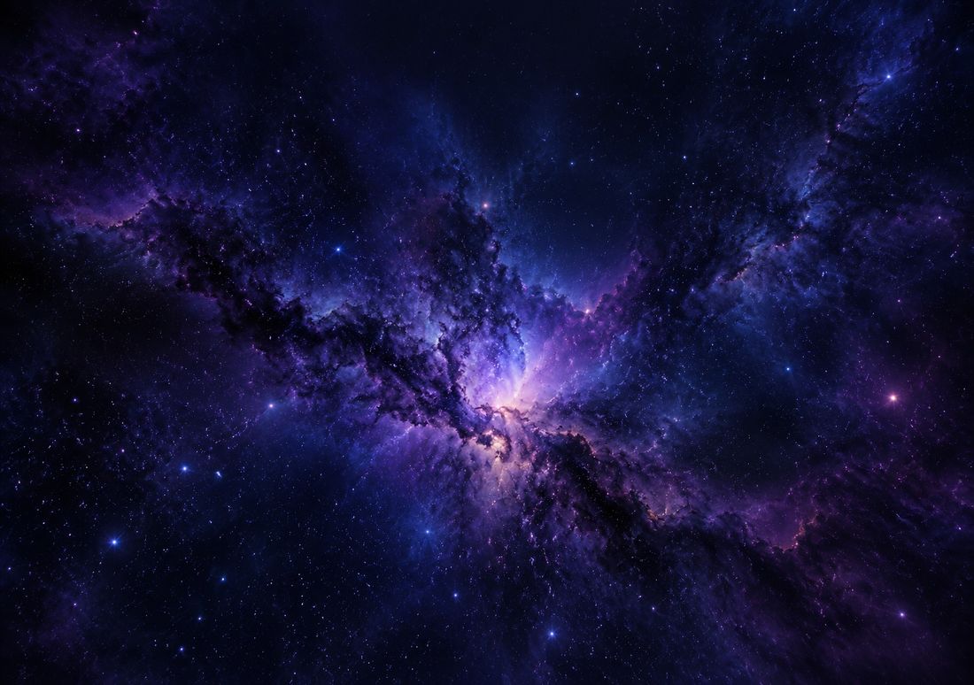
Our Crease Hiders collection is the natural starting point, because it was built for exactly this job. Deep Nebula, above, is the clearest example: indigo and violet dust lanes that are darkest exactly where the crease runs, so the fold disappears into the design. Black Marble works the same way with a different texture — dark stone with fine gold veins that wander instead of running straight, so there is no straight line for the fold to break. Midnight Silk is the softest of the three, a dark fabric with gentle folds of light that sit well behind app icons, and Smoke Ink is the most even, a dark wash with almost no bright spots at all.
Two more dark designs suit Dark Mode for different reasons. Northern Lights is dark at the edges and glowing in the middle, which keeps the clock readable — the top of the image is dark sky — while giving the Lock Screen a bright centre to look at. Carbon Walnut is the most practical Home Screen pick of the group: dark wood grain is textured, warm, and completely unbothered by app icons sitting on top of it. If you use Dark Mode all day, start with Deep Nebula on the Lock Screen and Carbon Walnut or Midnight Silk on the Home Screen, and the phone will look deliberate rather than merely dark.
Light Mode: what works, and our best picks
Light Mode is the harder of the two to get right, because the obvious choice — a bright white wallpaper — is the worst one for a folding phone. A flat pale background shows the crease at its worst, makes the white clock text disappear, and washes out app labels on the Home Screen. What works in Light Mode is not white but bright, even colour: a sky blue that is the same brightness everywhere, a warm sand, a soft green. The key word is even. A wallpaper whose brightness stays roughly constant across the whole frame will not fight the clock, will not show the fold as a bright line across a bright field, and will sit behind apps without creating glare spots.
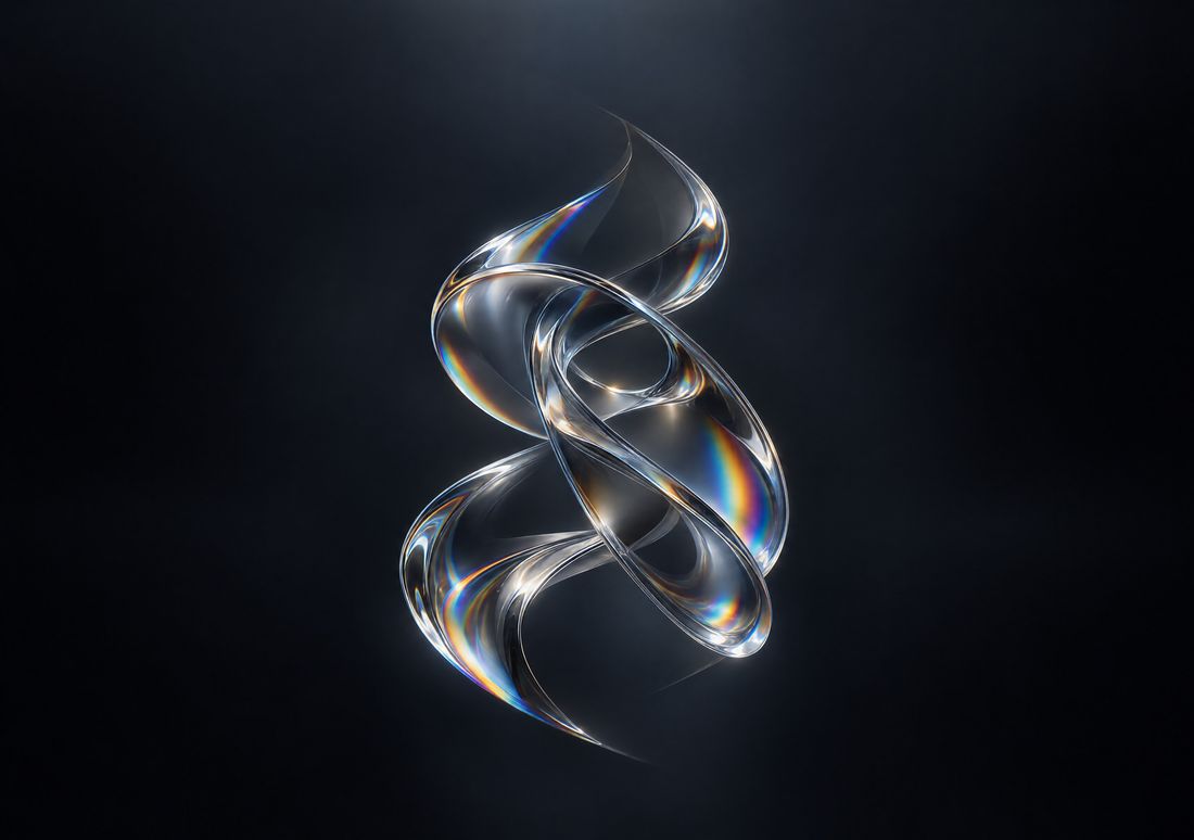
The Liquid Glass design, above, is the best Light Mode starting point on this site: translucent colour that stays even across the whole wide frame, with no bright patch at the top and no hard edge anywhere for the crease to interrupt. Gradient Mesh works on the same principle — a smooth blend of soft colours that changes gradually, so the fold crosses a gradient rather than a boundary, and the eye has nothing sharp to catch on. Bloom is the brightest of the three and the most cheerful, but check the top of the image before you set it: the bloom sits in the centre, and if the brightest petals reach the top of the frame they will compete with the clock.
For a Light Mode Home Screen, favour designs where the interesting detail sits low in the frame and the top stays calm. Cherry Path does this well: the path and the blossom are in the lower two-thirds, and the sky at the top is soft and even. Waterfall is the other good pick — moving water is naturally uneven, which hides the fold, and the mist at the top is pale but not glaring. Avoid any Light Mode wallpaper with white text, thin white lines, or a white sky at the top: the Lock Screen clock is white, and white on white is unreadable in sunlight, which is exactly when you most need to read the time.
Switching wallpapers when the mode changes
Since iOS does not swap your wallpaper when Dark Mode and Light Mode change, you have to do the switching yourself, and there are three honest ways to do it. The first is the manual way: keep two favourite designs — one dark, one light — saved in your Photos, and change the wallpaper when you change modes. That sounds like a chore, but in practice most people change modes at most twice a day, and changing the wallpaper takes about twenty seconds once you know the steps. If you switch to Dark Mode at sunset and back at sunrise, pair the two changes and they become one habit.
The second way is Focus. A Lock Screen can be linked to a Focus, and switching Focus changes the Lock Screen with it. Set up an evening Focus with a dark Lock Screen and a daytime Focus with a light one, and the wallpaper follows the mode you were already switching. This is the most reliable automatic option we know of, because it uses a built-in feature rather than a third-party trick, and it changes the Lock Screen on both displays at once. It does not change the Home Screen separately, and it does not track the Dark Mode setting itself — it tracks the Focus — so you need to switch the Focus when you want the wallpaper to change. For most people that is close enough, because the Focus change and the mode change happen at the same time of day anyway.
The third way is the Shortcuts app, which has wallpaper actions that can switch to a wallpaper you have already set up, and can run on a schedule as a personal automation. This is the most flexible option and the most work: you build a shortcut, attach it to a time of day, and the phone changes the wallpaper for you. It is worth it if your schedule is regular — dark at 9 pm, light at 7 am, every day — and not worth it if your hours vary. What none of these can do is link a wallpaper directly to the Dark Mode toggle. If you read somewhere that iOS swaps wallpapers with Dark Mode automatically, treat that as unconfirmed: we have not found any such setting, and the three methods above are the ones that actually work.
A simple rule for choosing between two designs
If you are torn between a dark design and a light one, decide by when you look at your phone most. If your heaviest use is in the evening — in bed, on the sofa, in a dark room — pick the dark design, because that is when a bright wallpaper costs you the most, and a dark one costs you nothing in daylight either. If your heaviest use is outdoors in bright sun, pick the light design, but choose one with even colour and a calm top, and accept that the crease will be slightly more visible. If you genuinely split your time evenly, pick the dark design for the Lock Screen and the light design for the Home Screen, or the other way round: the Lock Screen is the picture you see for seconds, so it can be bold; the Home Screen is the picture you live with for hours, so it should be the one that is comfortable.
Finally, test both modes before you commit. Set the wallpaper, switch the phone to Dark Mode, and look at the Lock Screen in a dark room. Then switch to Light Mode and look at it in daylight. The simulator preview on each design page shows the cover crop, which helps with framing, but it cannot show you how the design feels at midnight with the lights off — only the real phone can. Two minutes of checking saves you a week of a wallpaper that looks wrong half the day.
Questions
| Does the iPhone Duo change wallpaper with Dark Mode? | No. iOS does not swap your wallpaper when Dark Mode or Light Mode changes. You need to change it yourself, or link different Lock Screens to different Focus modes so the wallpaper changes when the Focus does. |
|---|---|
| What kind of wallpaper is best for Dark Mode? | Dark, low-contrast art with texture — deep indigo, charcoal, dark marble or smoke. Avoid a single bright patch, which draws the eye straight to the fold, and avoid pure flat black, which can make the phone look switched off. |
| What kind of wallpaper is best for Light Mode? | Bright, even colour with no white sky at the top. Smooth gradients and soft translucent colour work well; flat white is the worst choice, because it shows the crease and makes the white clock text unreadable. |
| Can I link one wallpaper to Dark Mode and another to Light Mode? | Not directly — there is no such setting in iOS that we have found. The closest working options are a Focus with a dark Lock Screen for the evening, or a Shortcuts automation that changes the wallpaper on a schedule. |
| Why does my wallpaper look too bright at night? | Because Dark Mode darkens the system but not your wallpaper. A bright wallpaper becomes the brightest thing on the screen in a dark room. Switch to a dark design in the evening, or use a Focus that changes the Lock Screen when you wind down. |
More guides: Wallpaper size guide · How to set a wallpaper · Different wallpaper per screen · Blurry wallpaper fix · On iPad, Mac & iPhone · Crease care · Best wallpapers · Lock & Home pairing · Holiday wallpapers · Live Photo wallpaper · Move wallpapers to Duo · Save & share wallpapers · Stretched wallpaper fix