Lock & Home pairing
Lock Screen or Home Screen? Pair them properly
The Lock Screen and the Home Screen are the one place on the iPhone Duo where you really can have two different wallpapers. They do different jobs, so they need different pictures — and pairing them well is mostly a matter of knowing what each screen covers up.
Two screens, two jobs
The iPhone Duo has two displays, but only one wallpaper poster. iOS takes that single poster and crops it for the inner landscape view, the inner portrait view and the cover — the cover shows the central strip, about 48% of the width at full height. That rule applies to the Lock Screen and the Home Screen alike: both displays show the same poster, cropped the same way.
What can differ is the poster itself. When you add a wallpaper, iOS asks whether to use it as a pair or to customise the Home Screen separately. Choose Set as Wallpaper Pair and both screens get the same picture. Choose Customize Home Screen and the Home Screen gets a blur, a colour or another photo of your own. That is the one genuine “two wallpapers” setting iOS has, and on a folding phone it matters more than on a regular one, because the same image has to survive two very different kinds of clutter.
The Lock Screen is a glance. You see it for a second or two, usually folded, on the cover. The clock sits at the top, and the picture behind it has to stay out of the way. The Home Screen is a workspace. App icons, folders, widgets and the dock sit on top of it all day, on both displays. A picture that looks great on its own can fail on either screen for the opposite reason: too busy at the top for the Lock Screen, too busy in the middle for the Home Screen.
What makes a good Lock Screen picture
Start with the top. The clock lives there, so the top quarter of the image should be calm and even — a dark sky, a soft gradient, a stretch of blurred background. A bright, high-contrast detail right where the digits sit will fight the clock for attention, and on the cover the problem is worse, because the cover is only the central strip of the image and anything at the top centre is exactly what you see. Every design on this site is composed with a calm top for the clock, for this reason.
Next, the centre. The cover shows the middle of the image and nothing else, so the Lock Screen subject has to live in the central strip. A subject at the far left or right of a landscape master will simply not appear when the phone is folded — and the folded cover is where you see the Lock Screen most often. Put the flower, the animal, the glow or the horizon in the middle, and let the outer quarters be background. That is also why the master is landscape, 2892 × 2034: the inner landscape shows the whole image, the cover shows its centre, and a portrait file would be the wrong input for both.
Third, the crease. Unfolded, the hinge runs down the middle of the Lock Screen. A face, a line of text or a single sharp edge sitting exactly on the crease will look split. Subjects that tolerate being divided — a sky, a nebula, a waterfall, a symmetrical design — survive it. Designs that are built around the fold, with the subject split deliberately at the hinge, survive it best of all.
Finally, contrast. The Lock Screen is usually seen in a hurry, outdoors, at arm's length. Bold shapes and a clear light-to-dark range read at a glance; fine detail does not. A soft, low-contrast image can look lovely in Photos and unreadable as a Lock Screen. If the clock is hard to read, the cause is almost always contrast, not size.
What makes a good Home Screen picture
The Home Screen has the opposite problem. Icons cover most of it. A grid of app icons, a widget or two and the dock sit over the middle and the bottom of the image, so a detailed subject in the centre will spend its life half hidden behind icons. What you actually see of a Home Screen wallpaper is the gaps: the edges, the strip above the dock, the corners between widgets. A good Home Screen picture is therefore a quiet one — a dark texture, a soft gradient, a faint pattern, a mostly empty sky.
Dark and plain beats bright and busy for a second reason: icon labels. White app names need a dark or mid-tone background to stay legible, and a bright patch behind one row of icons will wash those labels out while the row below stays readable. A dark, even image keeps every label the same. That is why the blurred version of a Lock Screen picture is often a better Home Screen than a second detailed picture: the blur keeps the colour story and removes the detail that would fight the icons.
The same crop rules still apply. The Home Screen on the cover shows the central strip, and on the inner display in landscape it shows the whole image. So a Home Screen picture still needs its calm area in the centre, not only at the edges — the centre is what the cover shows, and the centre is also where the icons sit. A picture that is calm in the middle and interesting at the sides is the wrong way round for this phone: the interesting sides disappear on the cover, and the calm middle is hidden behind icons.
How to set them differently
Save both masters to Photos first. On a Mac or PC, AirDrop or iCloud Photos is the least fiddly route, and make sure you download the 2892 × 2034 master with the Download button, not the 1100 px preview — a preview saved from the page will look soft once iOS enlarges it to fill the screen.
- Open Settings, tap Wallpaper, then tap Add New Wallpaper.
- Tap Photos and choose the master you want on the Lock Screen.
- Adjust the crop and style if you want to, then tap Add.
- Tap Customize Home Screen — not Set as Wallpaper Pair.
- Pick the second master for the Home Screen, or choose a blur or a colour if you would rather keep it plain.
To change an existing pair, touch and hold the Lock Screen until it lifts, tap Customize, and edit the Home Screen from there. If you tap Set as Wallpaper Pair by mistake, the Home Screen takes the Lock Screen picture and your separate choice is gone — you will need to set it again. There is no way to set a different Lock Screen picture for the cover and the inner display; both displays share the one Lock Screen poster, and both share the one Home Screen poster.
Four ready-made pairings
Each pairing below is a Lock Screen picture with a strong centre and a calm top, matched with a quieter Home Screen picture in the same mood. Both are free 2892 × 2034 masters; check each one in the simulator before you set it, so you can see the cover crop first.
1. Night sky — bold outside, quiet inside
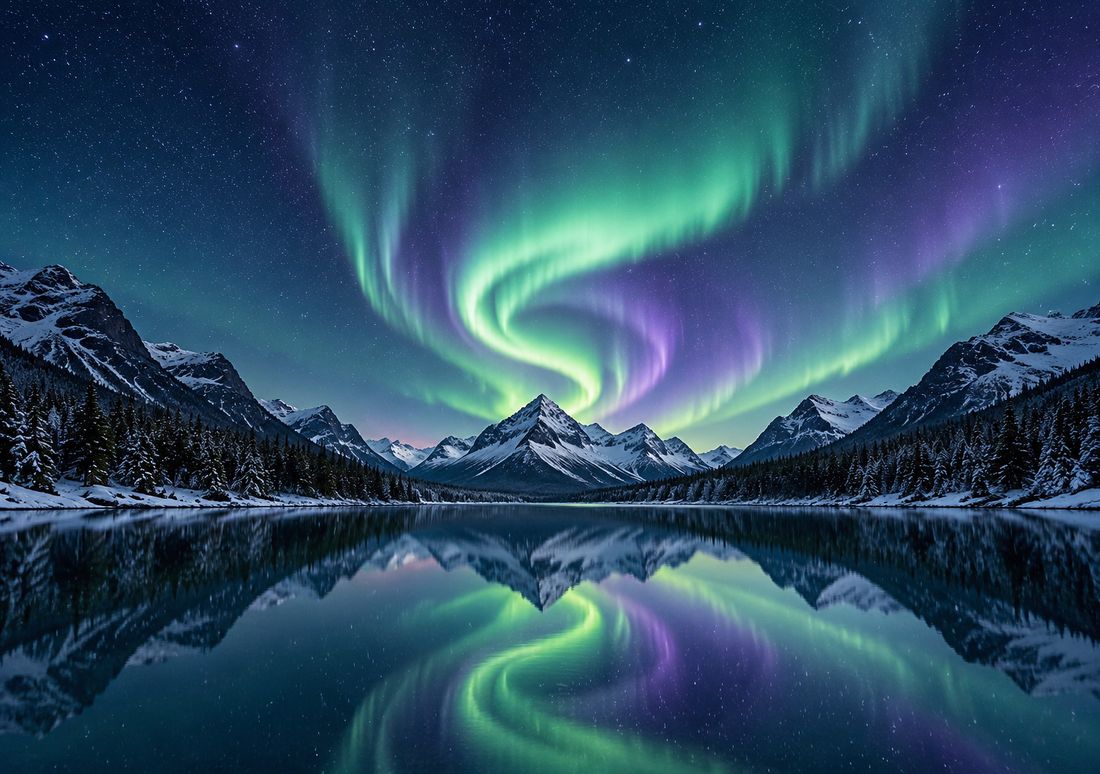
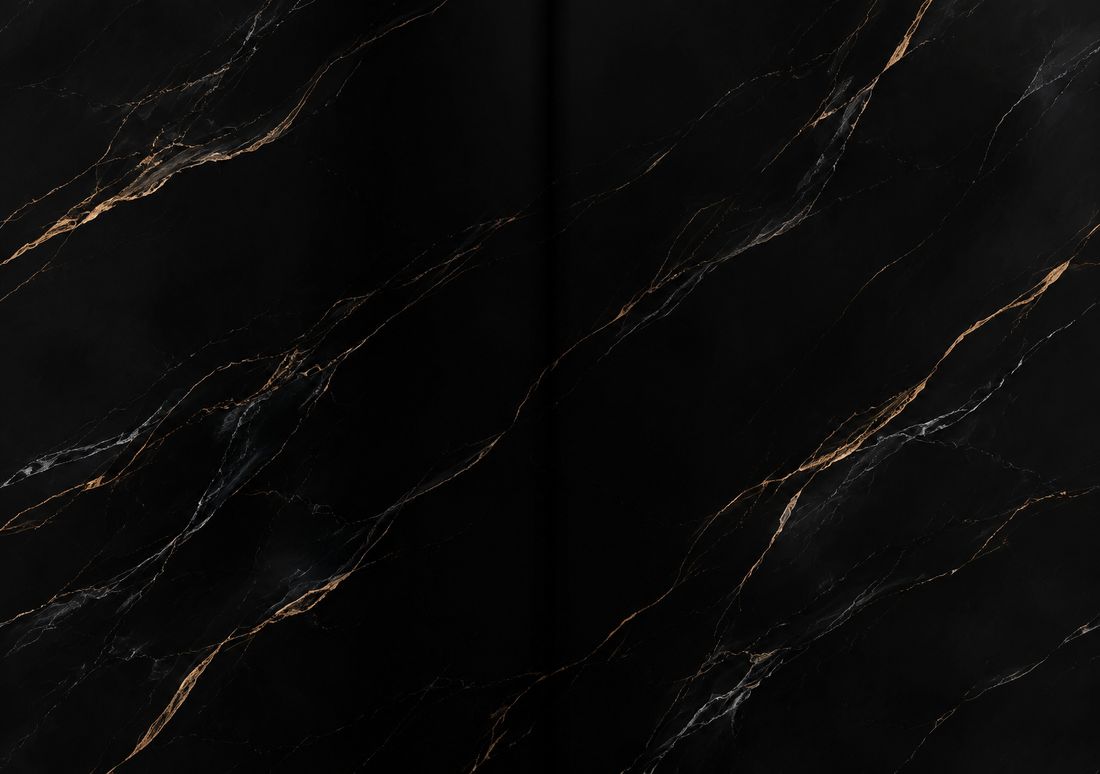
Lock Screen: Aurora Spiral. The lights spiral over a mirror lake, the subject sits in the centre strip the cover shows, and the dark sky at the top leaves the clock readable. Home Screen: Black Marble. Black marble with fine gold veins is dark and even, so every icon label stays legible, and the gold picks up the warm edge of the aurora without competing with it.
2. Soft colour — glow on the Lock Screen, gradient at home

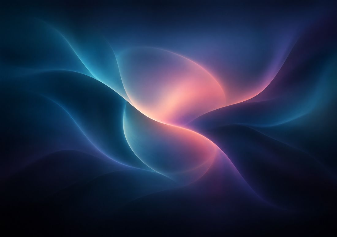
Lock Screen: Night Bloom. Glowing glass petals unfold from the hinge in violet and blue on black — a centred subject, a dark top, and enough contrast to read at a glance. Home Screen: Rose Mesh. A silky gradient of teal, indigo and a warm rose glow, with no hard detail for icons to hide. The two share the same palette, so unlocking the phone feels like the colour softening rather than changing.
3. Nature — a path to look at, a valley to work on
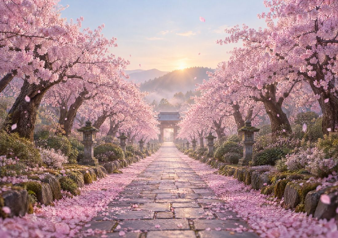
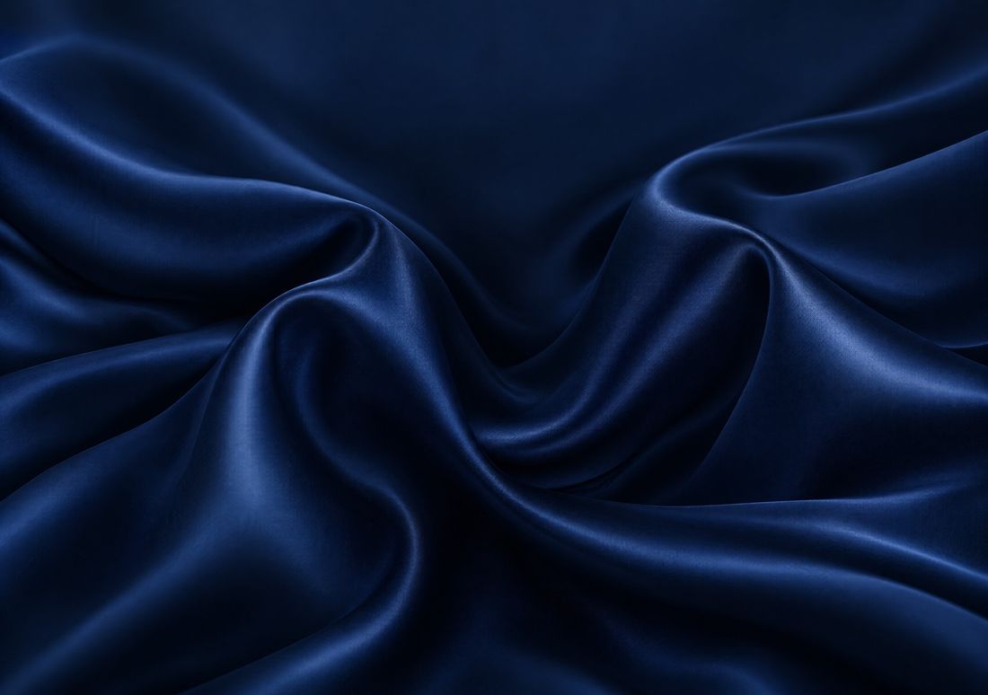
Lock Screen: Sakura Path. A path under cherry blossom vanishes at the hinge, right in the central strip, so the folded cover shows the destination and the unfolded inner display shows the whole walk. Home Screen: Midnight Silk. Soft folds of deep blue silk are calm enough for a full page of icons and keep the evening mood of the blossom without adding a second landscape to look at while you work.
4. Minimal — ribbed light outside, faint smoke inside
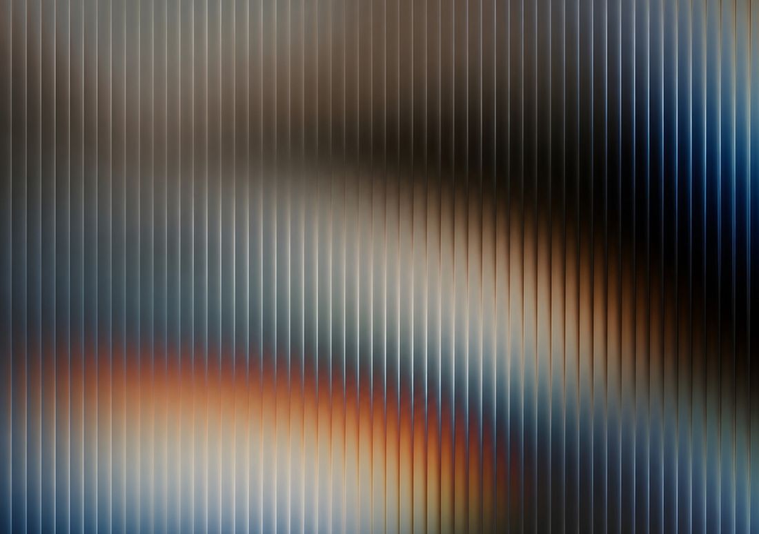
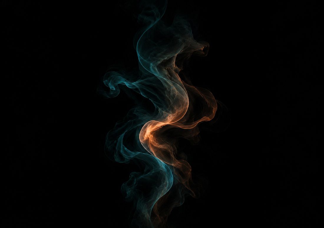
Lock Screen: Lenticular Dusk. A ribbed-glass gradient in smoke, amber and ink blue — strong vertical structure, a dark top for the clock, and nothing small enough to be lost on the cover. Home Screen: Smoke & Ink. Faint teal smoke curling through the dark: barely there, which is exactly what a Home Screen should be. If you want the two to match even more closely, use the blurred version of the Lock Screen picture as the Home Screen instead — same colours, no detail at all.
Letting them change on their own
A pair does not have to be fixed. A Lock Screen can be linked to a Focus, so switching to Work or Sleep changes the wallpaper with it — a bright picture for the day, a dark one for the night. Add several masters as one Photo Shuffle wallpaper and they rotate on tap, hourly or daily. And the Shortcuts app has wallpaper actions that switch to a wallpaper you have already set up, which you can run on a schedule as a personal automation. None of these split the two displays; they change the one poster both screens share, Lock and Home together or separately depending on how you set the pair up.
One thing we have not been able to confirm: whether folding the phone itself can trigger a wallpaper change. We have not found a setting for it on the simulator, and the Focus, Photo Shuffle and Shortcuts routes above are the ones that actually exist. Treat any video claiming the wallpaper swaps when you fold as unconfirmed until you can reproduce it on your own phone.
Mistakes to avoid
- Setting the pair by habit. Set as Wallpaper Pair is the first option and the easy tap. If you want two pictures, stop at Customize Home Screen.
- Putting the subject at the edge. The cover only shows the central ~48% of the width. A subject at the edge is invisible folded, which is where the Lock Screen is seen most.
- Using a busy picture as a Home Screen. Icons will cover the interesting part and leave the bright, empty part showing. Quiet wins at home.
- Setting a portrait file. A 1398 × 2034 cover file is the wrong input: set as the wallpaper, iOS crops a horizontal band from it for the inner display and upscales it about 2×. Use the 2892 × 2034 landscape master.
- Setting the preview. The preview on a design page is 1100 px wide. The download is the 2892 × 2034 master. A preview set as a wallpaper goes soft; the master does not.
- Leaving perspective zoom on for a borderline image. With the perspective effect on, iOS shows the wallpaper slightly enlarged, about 3% by our measurement, so it can move as you tilt. On a sharp image you will not notice; on a borderline one it can tip it into soft. Turn it off while customising the Lock Screen.
A quick checklist before you set a pair
Lock Screen: calm top for the clock, subject in the central strip, tolerant of the crease, strong enough contrast to read at a glance. Home Screen: dark and even, no important detail in the middle where the icons sit, same mood as the Lock Screen or a blur of it. Both: the 2892 × 2034 master, checked in the simulator first. The size guide at iPhone Duo wallpaper size has the numbers behind the crops, and how to set a wallpaper walks through the whole procedure step by step.
Questions
| Can the Lock Screen and Home Screen be different on the iPhone Duo? | Yes. When you add a wallpaper, choose Customize Home Screen instead of Set as Wallpaper Pair, then pick a blur, a colour or another photo for the Home Screen. Both still apply to both displays — the cover and the inner screen share the same Lock Screen and the same Home Screen. |
|---|---|
| How do I set a different Home Screen wallpaper? | Open Settings, tap Wallpaper, tap Add New Wallpaper, choose Photos and pick the master for the Lock Screen, tap Add, then tap Customize Home Screen and pick the second master. To change an existing pair, touch and hold the Lock Screen, tap Customize, and edit the Home Screen there. |
| What makes a good Lock Screen wallpaper on the Duo? | A calm top quarter for the clock, the subject inside the central strip the cover shows, and enough contrast to read at a glance. The subject should also tolerate the crease running down its middle when the phone is unfolded. |
| What makes a good Home Screen wallpaper? | A dark, even, quiet image — a texture, a soft gradient or a blurred version of your Lock Screen picture. Icons cover the middle of the screen, so detailed subjects there spend their life half hidden, and bright patches wash out the white icon labels. |
| Can the wallpaper change automatically, for example at night? | Yes, in three ways: link a Lock Screen to a Focus so it changes with Work or Sleep, use Photo Shuffle to rotate several masters on tap, hourly or daily, or use a Shortcuts automation to switch to a wallpaper you have already set up. Whether folding the phone itself can trigger a change is unconfirmed — we have not found a setting for it. |
More guides: Wallpaper size guide · How to set a wallpaper · Different wallpaper per screen · Blurry wallpaper fix · On iPad, Mac & iPhone · Crease care · Best wallpapers · Dark & light mode · Holiday wallpapers · Live Photo wallpaper · Move wallpapers to Duo · Save & share wallpapers · Stretched wallpaper fix